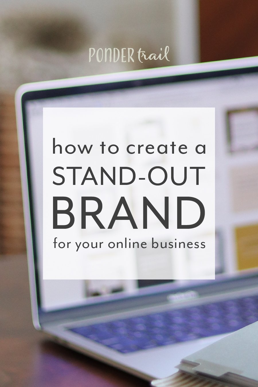
8 Signs of a Quintessential Logo
While your logo is one of many brand elements that make up the visuals of your brand, it has the notable ability to give people the gist of your business.
With just one mark, you have the opportunity to showcase facets of your company that go deeper than just your business name. This is a very powerful assignment.
A compelling logo grabs your audience’s attention, draws them in, and makes it easier for people to remember your brand.
It’s your business’s signature. Your X on the dotted line. And a logo designed with great intention and strategy reflects the care you give to each of your customers and clients.
While this is an area of your brand that can be creative, there are a few helpful guidelines to follow when it comes to an effective and quintessential logo.

Yours might be quintessential if . . .
1 // Your logo fits within your entire brand design, yet also stands out.
Your overall brand design needs to work together to create one cohesive whole. All elements should play off of one another and feel like a set that was designed with each aspect in mind (and hopefully they were). Every one of your brand’s elements should be easily recognized as belonging to your business.
However, your logo should be center-stage within your branding. It’s one of the features that come to mind when people think about your business. So it needs to shine a little bit brighter than your website’s icons or your font pairings.
Like the long-form title of a book, your logo takes your brand name a step further: it sums up what your business is all about and hints at the story—all in one strategic design. To be certain that your logo remains in the spotlight, it should have a place towards the top of your website. This demonstrates its importance and ensures that it’s one of the very first elements people see of your brand.
Related post: 7 Powerful Benefits of a Well-Designed Brand
2 // Your logo attracts and resonates with your specific target audience.
Perhaps one of the most important functions of a logo is its ability to appeal to your ideal customer or client and increase their interest in your business. Since your logo is such a strong element of your brand, it should be a design that your audience is drawn to.
The concept, fonts, colors, and every feature of your logo should be carefully designed with your customer or client in mind.
A logo that meets this goal will be a hard-working component of your business instead of a deadweight.
Related post: Why and How to Define an Audience for your Business, Blog, and Social Media
3 // Your logo is unique, original, and one-of-a-kind.
A logo should reflect your business’s unique personality. It should never be based off of another brand’s logo or inspired by another company's design. Not only is that plagiarism, but it won’t result in a unique logo or one that is true to your brand.
The goal is to have an iconic symbol that stands out from other businesses, so the design should always begin with a blank slate. Strategy, brainstorming, original ideas, and a sketchpad are the basis for creating a one-of-a-kind logo.
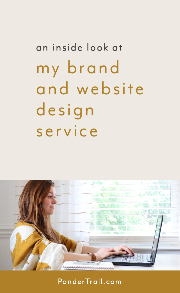
Related post: An Inside Look at My Brand and Website Design Service
4 // Your logo is simple, yet effective, and paired down.
The simplest designs that still convey a specific, intentional meaning are the strongest. In contrast, a logo that tries to cram in too many features looks amateaur and unprofessional.
Instead, it’s best to focus on what’s most important about a brand and come up with a clever way to show that through design. This results in an effective logo that clearly translates the business’s message.
If you’ve been following along with the Ponder Trail blog for a while, you might know that sketching logo concepts for a brand is one of my favorite parts of being a designer. I love brainstorming ways to use visual design to show a business’s foundation and purpose without the need to spell it out literally.
If you’re in need of a new brand design, I would love to chat with you. Take a look at my design services here.
5 // Your logo features a standalone font but includes your brand colors.
It’s best practice to use a different font for your logo that isn’t used elsewhere in your branding. This makes it stand out from the rest of your brand and gives it a stronger presence. This also gives it more authority and makes it become more of a focal point so it doesn't end up competing for attention.
Your logo’s colors, however, should tie in with the rest of your branding; this ensures everything comes together in one unified look.
Related post: What is Branding? And Why is it Important?
6 // Your logo has a collection of variations.
Your logo will likely need to serve your business in several ways:
showcased on your website
included on blog post graphics
shown on social media
printed on your business cards
printed on packaging or included on digital products
used as a stamp, sticker, button, or another clever way
To be effective in each of these roles, it’s necessary for your logo to have variations. For example, these common uses often require your logo to fit within different shapes and orientations. So it should have horizontal, vertical, and square options so you can use it effectively.
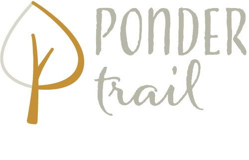
It’s also helpful to have a few submarks that pull out certain features. For example, on my blog posts, I use the text the Ponder Trail logo separately from the tree detail. This allows me to keep the design of my blog post graphics simple without them being cluttered with too many components. I also designed horizontal and vertical versions to give me the ability to use my logo in various layouts.
7 // Your logo is scalable from postage stamp to poster size and beyond.
Often times, your logo will need to be used on different scales, both small and large. For example, words in your logo can’t be so tiny that they are lost when printed on a small business card.
From postage stamp to poster and beyond, your logo should maintain its integrity without the need to be altered. This will save you from a headache down the road if you need to change the size for one thing or another.
8 // Your logo is a long-term asset.
Just like with the rest of your branding, your logo should be a lasting investment. To make this possible, your logo needs to be designed with your business's short and long-term goals in mind. This prevents it from becoming misaligned or out-of-date with your brand.
A logo that remains constant will build recognition around your company. This commitment also demonstrates that your business is grounded and established and isn’t shifting focus from day-to-day.
Therefore, a reliable and enduring logo gives the message that you serve your clients clearly and offer a dedicated product to your customers.
So it’s important to have an effective logo you can keep around for a good while.
Related post: 4 Key Areas of Branding
I would love to hear about your logo in the comments! What do you think about these qualifications? Does your logo meet most of them? Is it still in the works? Or are you hoping to get a new logo that represents your business and attracts your audience? Let me know your thoughts below!