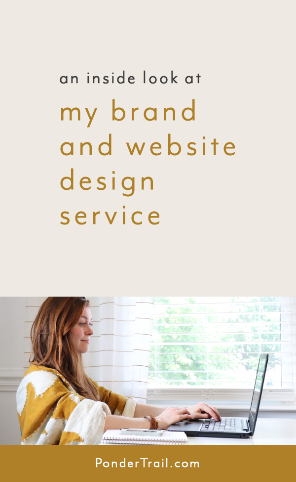
Brand and Website Design for TwigBerryStudio
As I mentioned in my previous blog post, I refreshed some key priorities this season in my business. One of the things I’m focusing on in a greater scope is taking on more design and strategy clients. And part of that includes posting each project to my blog to share with you.
I thought it would be fun to kick-off this series with a design that’s a little extra special to me. I’m excited to share it with you because this brand and website project actually features my very first creative business and the brand that kick-started my journey as an entrepreneur: TwigBerryStudio.
While I designed the bulk of this brand years ago, and while it’s been sitting in my portfolio all this time, I recently added a few finishing touches to accommodate several new ventures within my business, so it’s the perfect time to make its debut here on the Ponder Trail blog with a full project breakdown.
The fun part about today’s post is that you’ll also get a glimpse at the creative things I’m working on when I’m not writing blog posts, designing brands and websites, or working one-on-one with my brand strategy clients. Ready for the tour?

An Important Note on Rebranding vs. Refreshing
The only time I recommend a refresh is when a brand has already been intentionally designed from top to bottom and just needs some additions to accommodate the business as it grows and shifts.
Your design should have started with a deep dive into strategy because that’s the secret to creating that perfect brand identity for your business.
If the brand design no longer serves or suits the company or feels a little dated, a full rebrand is the best way to go since you can start with strategy and create a design that will take your business to the next level.
Because a simple refresh can end up looking like a patch job or a bandaid and have an unintentional, eclectic look if working with an existing design that needs work.
Small Business Start-Up Story
The Makings of TwigBerryStudio
If you’ve been reading the Ponder Trail blog for a while, you might know that I officially took the plunge and started my first online business in 2016.
But first, an even farther throwback. I had created it as an Etsy shop years prior as a hobby while I was in high school and always knew I’d turn it into something more someday. I came up with the name TwigBerryStudio, which was inspired after a necklace I’d made (my shop started out with handmade jewelry).


Flash forward, after lightly dipping into the world of Etsy and trying several ideas, I decided to take the plunge and launch a product line.
I designed my logo, business cards, packaging, labels, and made sure each product fit inside the brand. I fell in love with running a small online shop and soon designed a website so I could develop my brand identity, build a newsletter, and house my handmade products within my own headquarters.
And I bet you can guess which platform I chose. Yep, Squarespace.
TwigBerryStudio gave me my start with designing brands and websites for creative businesses. There was just something about creating a full design aesthetic and bringing it all to life that made me enjoy graphic design and branding even more (it was another one of my hobbies).
My handmade shop also gave me experience with starting and growing a side hustle, which eventually led me to launch this blog so I could share those insights with other creative entrepreneurs.
Over the years, I’ve honed in a bit more on my specialization for my fiber company, so it was time for a mini branding boost to freshen things up and highlight a few new products.
Brand Style Throw Back
Before we walk through the design process, I thought it would be fun to show you what the TBS logo looked like when I first came up with the name and designed its first business card. We’re talking circa 2010. This was back when I used Microsoft Word for all of my graphic design needs. (Where there’s a will, there’s a way!) I’m pretty sure that program still quakes in fear anytime I hover over the “launch app” icon. It hasn’t forgotten the various ways I managed to max it out and crash it. Whoops!

Now it’s time to dive into what the shop looks like today.
Brand Identity and Squarespace Website Design
About the TwigBerryStudio Brand
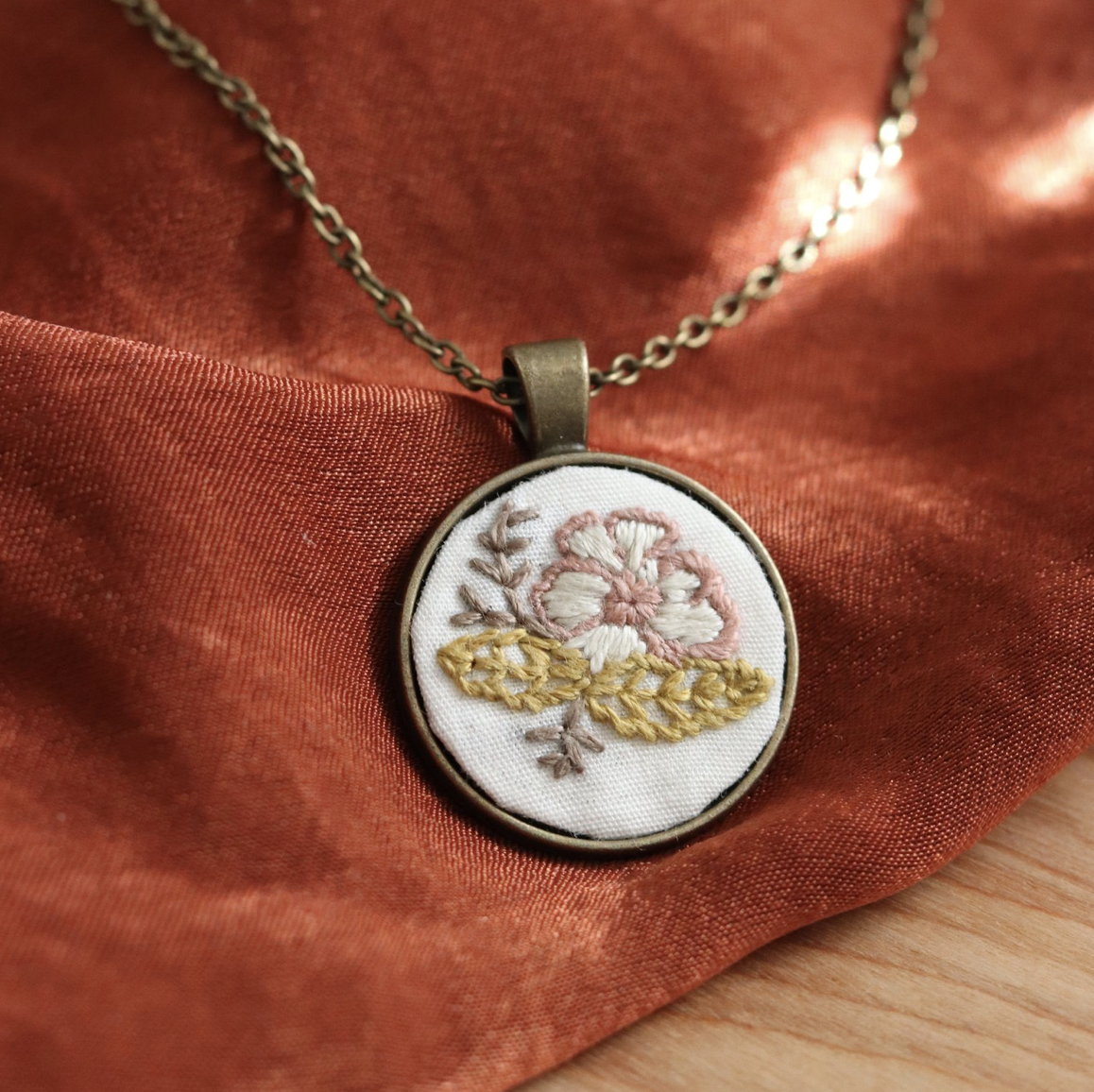
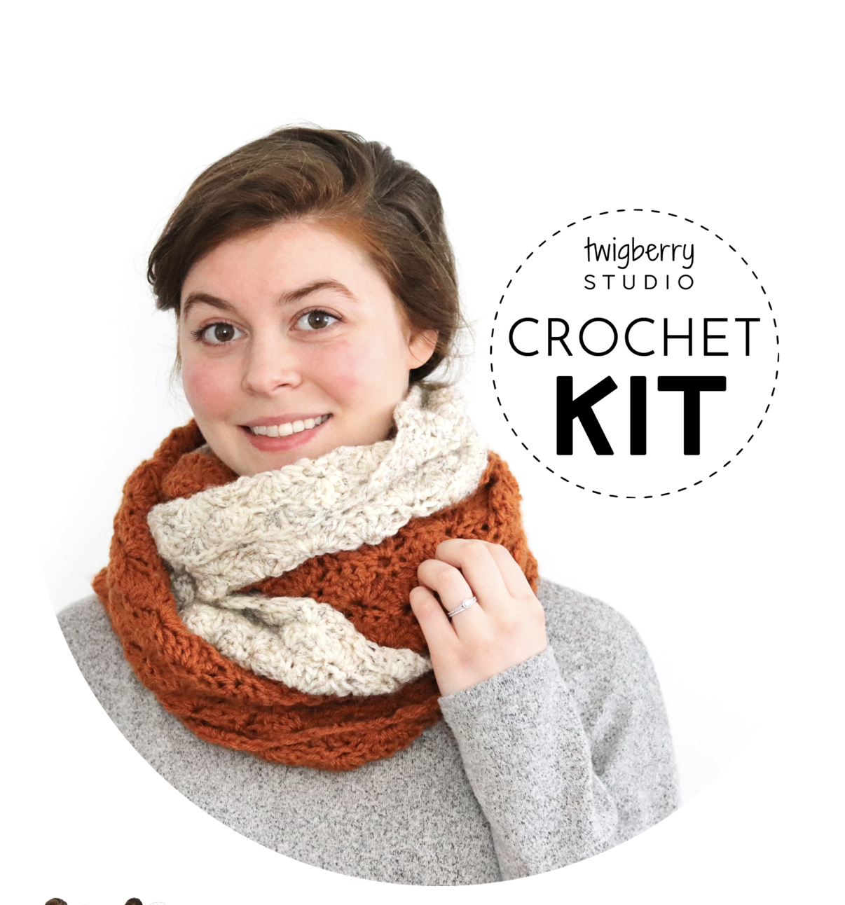
TwigBerryStudio is an online fiber arts boutique centered around original, modern crafts and handmade goods for makers. TwigBerryStudio offers DIY kits, project patterns, fiber, and functional project bags and tools to help yarn-lovers and crafters stay inspired and create cozy things with their hands.
I’ve been making things for as long as I can remember, and I love being able to share that passion with other creatives and makers.

TwigBerryStudio’s Brand Style
Overall, I like to describe TwigBerryStudio’s brand style as a “unique twist where modern meets nature.” I pull inspiration from nature for each product I design and create for the shop, and I develop that feel with colors and elements throughout the entire brand.
Products
Crochet and knitting patterns are one of my main products along with embroidery kits which are one of the new additions. Some products vary throughout the seasons too.
Each product is flavored with nature through the visual look and feel but also through product names. Each knit and crochet pattern has a unique name that features things you’ll find in various terrains and places in nature.
Since my brand is centered around the handmade products, they lead the direction for all of the design decisions.


Brand Color Palette
The TwigBerryStudio shop is filled with select saturated colors you’ll find in the forest. Lichen, ferns, birch trees, moss, pine needles, and fungi are my go-to for color inspiration.
Meanwhile, I use earthy tones, neutral shades, and natural elements throughout the packaging and other brand elements.
The neutral base with pops of color bring the products to life and make them the focus. It keeps the brand looking modern and gives it an overall neutral, earth-tone look. I also stick to a specific palette of colors across the products to create consistency.
This strategy allows me to use vibrant colors without feeling “party confetti colorful,” which would not fit with the brand.
Brand Photography
With TwigBerryStudio, I stick to two styles of photography:
A simple, clean, modern shot that showcases a product on a neutral background with lots of space around it.
And a more dramatic, styled shot that plays off of a product’s colors and creates a more moody woodland feel.

Over the years, I’ve taken most of the photos for my brands and have figured out several great hacks for doing it on your own, but I also get help sometimes too. My husband was the cameraman behind my last few headshots for TwigBerryStudio. And my sister is a talented photographer, so she often helps with with product photo shoots. (I’ll be sharing a little more about how she assists me with other business-related tasks too, so stay tuned for some exciting news!)
Strategy for Brand Design Elements
From the start, my goal was to design branding that would highlight the handmade products and ensure they would be the star of the show.
As I mentioned, I didn’t want TBS to be too colorful. So I created most of the brand elements in black and white to pop against the products and to give everything a refined, modern feel.
The products and artsy photography shots bring in the woodland feel, and the black logos, icons, and marks bring in the modern style. The natural material of the brown paper packaging with black ink ties the two together.
Now let’s walk through the new brand elements that were part of the mini refresh.
The Design Refresh
Refreshing and Refining the Brand Design
As TwigBerryStudio has changed and grown, I’ve added bits and pieces to the visual side of my brand as needed. I refined my logo a time or two and created new packaging as I added different types of products.
At the beginning of last year, I launched several craft kits and started teaching online classes. As I’ve added more kits, I needed to design additional packaging as well as collateral pieces for digital and printable resources including stitch guides and printable templates for some of the instructions. I also designed a new collection of themed icons to bring everything together on the site.
While the overall style still fits perfectly and there were only a few key changes, this refresh took the brand to a whole new level, and it feels even more professional and polished. I love how it all came together.
Key Changes
Logo Tweak
I didn’t need to recreate the logo since it still worked perfectly for the brand. This is always the goal for a logo: to stand the test of time; and I’m happy to report that it has.
I did change it slightly, though, with a few tweaks to the letters in my logo, but I might be the only one who noticed this tiny refinement.
When I first designed it, I played off of the modern-meets-nature feel of the products. Sine the products and photographs are a bit more colorful, I kept the logo black and white to make it stand out and bring in a touch of minimalism. I wanted it to have an organic feel since I hand-write my logo on each tag I sew onto my products.
When figuring out the design, I drew it in my sketch book to decide what kind of writing style looked best. Though I went with a similar looking font when I digitized it because I was so excited to get my shop up and running. But I wasn’t completely in love with the style of several of the letters. I did fix a few little letter details over the years, but never sat down to finalize it. (Being a brand designer, I find this quite funny; for some reason, it’s always 10,000 times more difficult to design for yourself.)


For this brand refresh, I finally wanted my official logo to match the product tags to a T (literally). So I made those changes to bring in a more handmade feel to match the official way I draw it. Now, my logo is perfect!
New Branded Icons
For the icons, I wanted to create a more modern feel, yet still give them a woodland-ish style with a whimsical touch of fantasy. So I decided to draw hand-drawn icons and take a black and white approach to tie this together and keep them consistent with the rest of the brand.
I designed icons to represent knitting and crochet patterns, yarn, project bags, and craft kits. Most of them are multi-purpose, too, so they can stand for several different things within the brand and across the website.
As usual, they are one of my favorite elements of the design!

Digital Product Details and PDF Designs
I added the icons to the “about page” of the new digital products and am in the process of updating the existing ones. I also created several stitch guides and printable pattern templates for the embroidery kits.


On this page, I actually use just a touch of my green brand color in the font to make it easy to spot a few links that lead back to the website.
I also refreshed the font to match the styles on my site, and I refined the cover pages to have a more modern feel.
One detail I’ve had since the beginning is a branded stamp on my digital download product photos. It has my logo along with the type of pattern or category in big letters so it’s easy for viewers to spot which type of pattern it is (knitting, crochet, etc.) while browsing. It also has a double dashed line circle that looks like stitches to tie in with the craft theme and help it stand out.

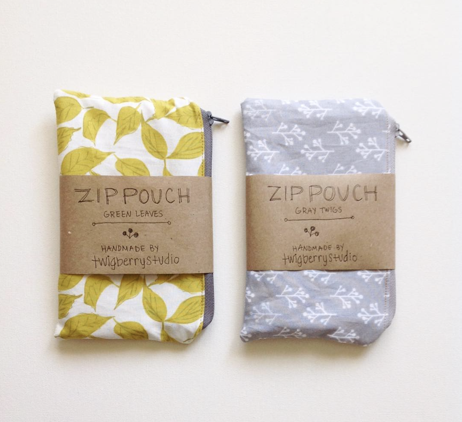
Branded Packaging
Packaging consists of brown paper elements with black ink. To make the business card a little more noticeable, I use white paper with black ink.
I created simple logo stickers to add to small brown paper boxes, and I designed envelopes to package the patterns, materials, and tools that come with the DIY craft supply kits.
Other packaging details include natural jute string and silver tape.


Squarespace Website
To tie it all together on the website, I added the new icons to my home and shop overview pages. I also use the same green brand color for links and site navigation to call attention to them. And the product photos add the pop of color and bring the brand to life.


My website strategy and function was already in good shape with a focus on showcasing products, inspiring visitors, and pointing people to the free library for newsletter subscribers but I did focus on ways to take it to the next level.

I revisited my shop categories to organize and streamline the options a bit. The storefront setup makes it easy to filter products and gives browsers a dynamic and user-friendly experience.

While a main goal behind my website is, of course, to grow my email list and sell products, I also strive to provide free resources for makers. I make this possible through the blog content and the Maker Tools Library.


Squarespace’s mobile-responsive design is icing on the cake for visitors who like shop and peruse on the go.
The TwigBerryStudio website is one I’m proud to share with people since it clearly represents my brand and I’ve put so much hard work into it. It’s the perfect head quarters for my handmade business, and I’m excited to see what’s in store for the future.

So there’s an inside look at my brand and website design refresh for TwigBerryStudio. I love how everything came together. What is your favorite part about the design?
Custom Brand and Website Design
If you’re looking to take your brand and website to the next level, I would love to chat with you! I work 1-on-1 with clients and only take on one project at a time thanks to my unique process that puts 100% focus on your design. Take a look at my branding services and contact me to get started.