An Inside Look at the Strategy Behind My Homepage
Blog Pod Audio // Listen to the Post
Last week, I shared a post about the 7 essential pages to include on your website. As I was writing, the content I wanted to share about the strategy behind a homepage kept growing, so I decided to create an in-depth post dedicated just to this one topic.
If you're itching for a look behind the scenes at the thought process and purpose behind an effective homepage, this post is for you!
If you already have a website, or if you're are just getting started with one, I hope you enjoy today's insights as I spill the beans on the strategy behind my homepage.

Homepage Objectives
The main purpose of the page is to give an overview of my business’s main features so people can quickly understand my brand and know if it’s exactly what they’re interested in. Another goal of my homepage is to get my audience excited about my business and eager to return for the latest resources.
I outlined Ponder Trail’s different types of content with links to click and explore. It's like a quick-start guide to my brand, and it helps my audience get a view of the rest of my website.
I designed a page that was simple and easy-on-the-eyes to welcome newcomers and loyal followers alike. I incorporated a lot of whitespace into the layout of my homepage, only a little bit of text, and photos and icons to add interest and brand details.
By creating a space that wasn’t cluttered, I was able to include the highlights of Ponder Trail without overwhelming people.
The result is a homepage that *hopefully* is enjoyable to explore and gets viewers excited about my brand.
Inviting Title
Because I want everyone to view my homepage, and since not everyone will land on it the first time they end up on my website, I included a link to it in my navigation. This makes it easy for a new audience member to click over to my main page and see the details about my business that I want all of my viewers to know--even from the first time they visit my website.

To encourage people to click over and view it, I titled it “Start Here”rather than simply calling it the generic “Home.” It makes it more catchy and inviting. And since it includes an action verb, it’s a CTA (call-to-action) in and of itself, too, which is more effective than a passive page title.
Simple + Effective Intro
At the top of my page, I created a short and sweet intro to my brand and website.
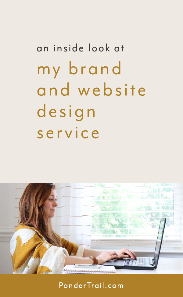
I included a photo that gives a glimpse what my brand encompasses. This peek behind the scenes (me working at my laptop, bringing brands and websites to life), ties in Ponder Trail’s brand colors and overall style.
I also added Ponder Trail’s tagline to give a little description so new visitors know exactly what my business is about.

Primary Call-to-Action
While there are several actions to take and explore on my homepage, the primary CTA (call-to-action) I wanted to include was my free workshop.
This course also acts as my newsletter opt-in freebie, so it was important to emphasize it. I placed it towards the top of my homepage under my branded photo and brand description. Positioning it as the first piece of actionable content on the page makes it easy to spot.

I wanted this helpful resource to be easy and convenient for my audience members to access, so I created a sign-up form right on the page so people can join the course without leaving the page.
When someone signs up, they are automatically added to my newsletter list so they also get my weekly Trail Crumbs resource and updates about new additions to the course.
(P.S. If you want to write brand messaging that resonates with your ideal customer or client, you can sign up for this free course right here on my homepage.)
"About Me" Blurb
To give a quick introduction of myself, I added a little blurb about me.
It consists of a photo, a few sentences, and a link to my “About” page. It’s a little section that speaks to my audience, peaks their curiosity, and relates to their struggles.

This caption-sized version of my bio tells who I am, why I created Ponder Trail, and how my business helps my audience. And there’s an engaging one-liner about my story, too.
Readers can click to learn more and to find out how chalk dust and a magical world started my journey as a creative entrepreneur.
Free Resources Guide
I focus on content marketing. In fact, it’s my biggest strategy for building a loyal following. This looks like helpful blog posts, podcast episodes, and worksheets about starting and growing creative online businesses.
Anytime someone lands on my business, my hope is that they’ll explore my resources, read some blog posts, check out my podcast, and find so much value that they have a hard time leaving. This is a crucial and large component of Ponder Trail, so my homepage outlines these free resources.

Because I share new tips and strategies on a regular basis, I wanted my audience to know when they can expect new content. So I listed how often I add to each content venue. This gives my readers a reason and a time to return to my website for the latest resources.
Keeping my audience in-the-loop, also invites them to truly become part of the Ponder Trail community and builds more anticipation for the latest blog posts, podcasts, and newsletters.
This section makes my page double as a navigation map around my site, which remains helpful for returning audience members, too.
A Peek at My Services
On my homepage, I give a peek at how creative entrepreneurs can work with me.
For each of my services, I designed an icon and wrote a brief description about my custom, one-on-one services and added “Learn more” links to pages dedicated to their details.
It lets people know what I specialize in and where the most value in my business lies.

I placed them at the bottom of the page because I want my audience to explore my content first so they can learn more about me. Building trust is an important part of booking clients, and it’s always at the forefront of Ponder Trail.
I always want my clients to feel 100% ready and on-board with working with me before they book my services, and my free resources are a great way for them to do that. As my audience reads my blog posts and explores my podcast and other resources, they get a better feel for my approach to branding and for my teaching style.
Branded + Cohesive Design
I saved the best for last!
As you can see throughout the photos in this post, my homepage is branded.
Along with every other page of my website, it’s an extension of my brand. It ties in with the overall theme, style, and feel of Ponder Trail. My fonts are streamlined, my colors are coordinated, and my icons are consistent. My photos feature the aesthetic of my brand and visualize what my business is and does.
My homepage is also organized, to-the-point, and user-friendly. It guides my audience through the page without unnecessary information, which would be distracting and overwhelming.
A cohesive and intentionally designed brand and website is the best way to tie a brand together and have a professional appearance online.
Interested in having a better branded business and website? Let's work together! View the details here.
Well, that wraps-up this blog post. I’m so happy with how my homepage turned out, and I hope you enjoy using it, too!
Did you enjoy taking a peek behind the curtain at the strategies that went into designing my homepage? Would you look to see more posts like this from Ponder Trail?
Have you implemented any of these strategies? I would love to hear your biggest homepage tips. Let me know in a comment below!
You might also like . . .


Want even more?
Enjoy what you're reading on the blog? Subscribe to the Ponder Trail Newsletter for weekly action steps on implementing strategy and purpose in your business.